Press ESC to close

5 Steps to Help Students Fall In Love With Data Analysis


One of the biggest hurdles teachers face when incorporating data analysis into their classrooms is its reputation. Students (and even adults) hear “data analysis” and often immediately think “boring” and “complicated.” 

But data analysis is far from boring! It is one of the most thrilling and rewarding aspects of scientific investigation. It’s how we turn our raw research into something meaningful—it’s how we draw conclusions and discover new questions that we can share with the rest of the world. Data analysis is literally the engine of science itself.

At the classroom level, every student needs to understand and feel comfortable with data analysis early in their science education. It is a big component of standardized tests, and it’s crucial to all advanced science coursework.

Luckily, there are many ways to integrate data analysis organically into your existing curriculum.

Create “Buzz”: Current Real-world Data

If you’re a science teacher, chances are that you might send a text to your friends, family, and colleagues that looks like this: 

“Did you see that study about the spread of lanternflies?!”

Why does this kind of data analysis grab your attention?  Because it has urgency. It’s breaking news—a phenomenon underway right now. All kinds of urgent news like extreme weather events and natural disasters can provide many opportunities to bring data analysis into the classroom. You might even look at maps of active volcanoes, recent earthquakes, and tectonic plates.

The lanternfly study also catches our attention because it highlights something happening in the real world. As tempting as it might be to “practice” data analysis using made-up or simplified data, that tactic makes the learning feel abstract. It becomes something that only matters in the classroom. By contrast, when students use data analysis to make sense of actual phenomena in the world around them, they feel excited and like their effort has genuine meaning that they’re excited to share with other people.

The ”buzziest” data is relevant and relatable to students’ own lives. For example, a disease outbreak in a faraway species of voles might not be the most gripping study of epidemiology data. But a study called COVID-19 hospital admissions levels in U.S. by county” will grab them right away.

Students love a good real-life mystery or challenge, no matter where or when it is happening, as long as it is still relatable. Even if there are no glaciers nearby, exploring how melting glaciers enlarge lakes can be exciting when comparing satellite imagery over time.

The things we remember most usually have a hook and some drama. That’s why using gripping, real-world examples is a key teaching hack.

Looking for reliable data to enrich your science lessons?   Check out some science-packed data resources at the end of this post.

Add More Variety

Part of why data analytics gets a bad rap is because we define it too narrowly. Yes, it’s important to know how to create and read charts and graphs, but there’s incredible data embedded in many other places: maps, microscopic and satellite imagery, history, pop culture, and the natural world.

Data is any known fact or information that we can interpret. When we think of it this way, we open up a whole new world of options. The more types of data we expose students to, the more intuitive it will feel for them to analyze data and immerse themselves in the process.

With this approach, students start seeing data everywhere and the next step of data analysis comes naturally; they’ll start comparing different sources of data, different kinds of data, and different methods of data representation. You can also demonstrate this in class by having students work in groups or teams  with each team creating a different representation for the data. For example, when doing a genetics lesson, one team  might look at mutations data with charts and illustrations while others look at genetic analysis and historical records.

Beautify the Data

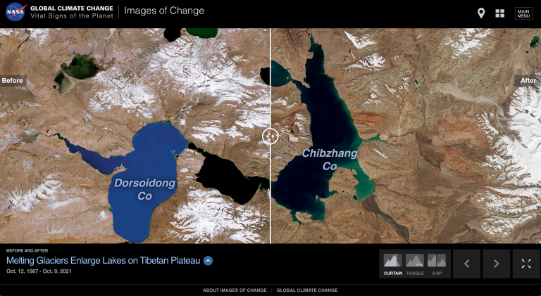
Data visualization—the way data is presented—makes all the difference in the world in terms of student interest. A color-coded, interactive model of rising sea levels is much more of an attention-grabber than a black-and-white graph.

Check out some of the “coolest” data visualizations from 2022 picked by the New York Times.

Better data visualization not only holds students’ attention longer, it also  helps data analysis to feel more inventive, artistic, and creative.

Tell Stories with the Data

At its most engaging, data analysis does not just end with understanding a chart or a map. Instead, that understanding should push the students to draw larger conclusions, ask deeper questions, gather more data, and make more discoveries.

So, as you’re looking for data-rich resources to bring into the classroom, choose materials that spark that next level of engagement. Ask yourself: 

  • Does this data invite students to explore a bigger “story” in the world? 
  • Does it invite students to question and interpret differently? 
  • Does it invite students to do their own further research?
Do It Yourself

While studying data and how it’s represented is essential, it’s just as important for students to “do data” themselves. For example, once students understand graphs or maps, give them raw data and let them do graphing or map-making themselves. You could pair a lesson that relies on published geologic timelines with an activity for students to make timelines of their own.

Here are some of our go-to sites for fascinating and reliable data.

Resources for Great Data:

Author

Leave a Reply

Your email address will not be published. Required fields are marked *